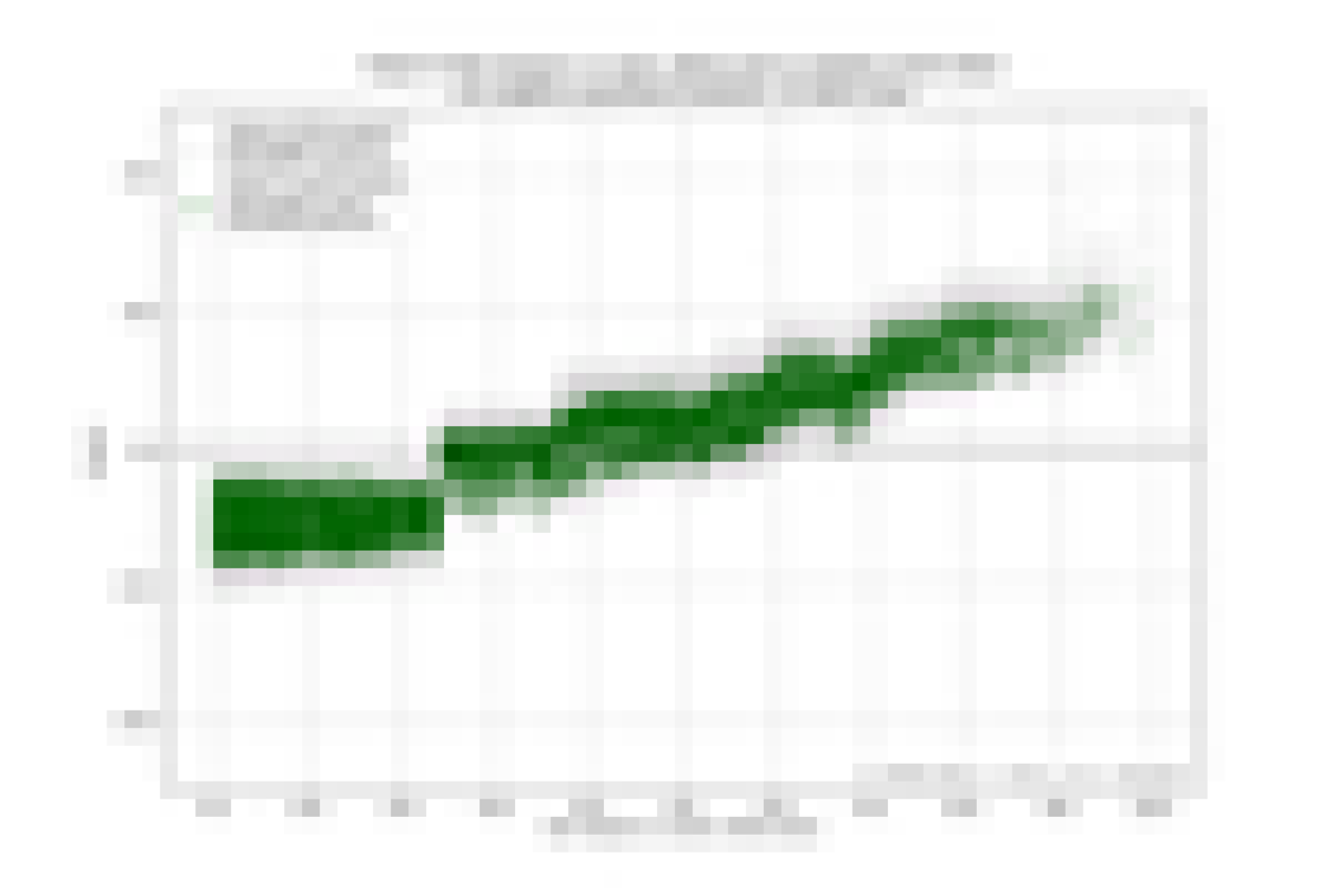
Impact
The impact chart below shows the impact of a single feature on the prediction made for each census tract in the county. The green dots are mean predictions for each tract. Each green dot's x coordinate is the value of the feature for the tract. Its y coordinate is the impact.
For each tract there are also 50 gray dots vertically above or below the green dot. These are the predictions of 50 independent models. They function as error bars to give an idea of the variance of the impact.
Data Coverage
In order to make it clear what data went into the impact chart above, we have produced the maps below. For details on how to interpret the maps, please see this post.